Accepted/Completed Add am_jungle

BlepTheHusky

Member
Joined
Dec 30, 2020
Messages
14
Reaction score
2
Points
3
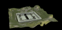
I just finished adapting aim_jungle (a map I created a while back) into am_jungle. There are 16 arenas.

My friends and I have tested this map thoroughly in our free time (thousands of rounds) and have found it fairly enjoyable and balanced.

There's really only one head-glitch spot which is on the ramp by the box but it's not too difficult to deal with and it's not much different than the ramp head glitch on dust II when looking towards catwalk. Let me know if there are any issues and I can look into it.
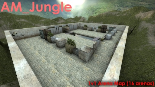

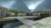
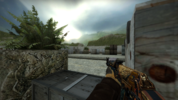
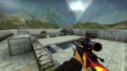
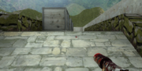
let me know what you think! Below are higher resolution versions of the images on the steam workshop

overview.png

top_down.png

2.png

ak.png

awp.png
 
The map looks pretty good! There are few visual things that I would suggest.

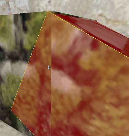
One is I would try and redo the dirt barrier around the arena. Specifically sewing each corner so that it better feels like it's wrapped around the map and maybe making it a little less jagged. If you need help with that feel free to add me on steam.

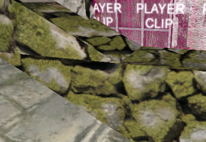
This one's really minor but I would suggest you try and remake this brush.

The map seems like it would play really well for 1v1s.
Absolutely, great suggestions. I did make this almost half a decade ago.. ill see what my 2021 hammer self can do about those pesky displacement corners and that random slice lmao. That was actually the first time I ever used displacements when making a map.

Ill reply again once I've fixed those errors.
 
Corners are all patched together now and it does indeed look better from inside the arena good suggestion. those improperly sliced brushes by the ramps are also now properly attached.

Steam moderators have already approved this update on the workshop for the public ^_^. Please let me know if anything else needs to be done.


1609695414703.png
 
there's a few things I noticed.
here's an imgur album

I went ahead and looked at your map in hammer, everything seems to be off grid so I'm not sure if you want to take the time to align everything.

Biggest problem I noticed was both spawns are not equal in size
DbEYoye.png

WAYVjGc.png
 
Last edited:
there's a few things I noticed.
here's an imgur album
Yeah, the slicing caused the textures to be a little weird on that part of the ramp for your first image and for the second one, is the one unit bump there an issue? Its never come up in any of my playtesting and looking at it further it actually kind of makes the horizon when dealing with ramp to ramp combat look cleaner cut should that situation occur as seen below:
1609704106899.png
 
Yeah, the slicing caused the textures to be a little weird on that part of the ramp for your first image and for the second one, is the one unit bump there an issue? Its never come up in any of my playtesting and looking at it further it actually kind of makes the horizon when dealing with ramp to ramp combat look cleaner cut should that situation occur as seen below:
View attachment 762
I was purely looking for things outside playability as you mentioned you've tested it a bunch so I'm sure it's fine.
Mostly just a visual thing, figured I would go ahead and point it out.
 
there's a few things I noticed.
here's an imgur album

I went ahead and looked at your map in hammer, everything seems to be off grid so I'm not sure if you want to take the time to align everything.

Biggest problem I noticed was both spawns are not equal in size
DbEYoye.png

WAYVjGc.png
oh sorry I just saw your edited message. I didnt even realize the spawns werent the same size. I just ported this over from the version I uploaded to the workshop in 2014... I will go and fix the spawns and the bridge (and maybe those sliced textures) later today. Though besides the spawn sizes the rest of the map should be symmetrical. I do tend to snap to the nearest 1 unit so it might be off a larger size grid (and probably explains the bridge mistake). Sorry for the inconvenience.
 
The map submission on the workshop has been updated with the fixes I mentioned above.
 
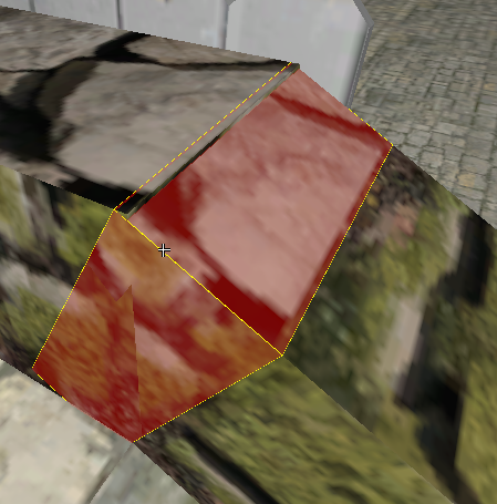
Still a few clipping and texture alignment problems for the "railings"(not sure what to call them 😅) on the bridges, up to you if you want to fix them, other than that map looks good 👍


Ez0Dz9X.png
965rEwu.png

Vertex tool can fix this easily, just gotta align the corners
wFZknNK.png

you can delete this small brush and use the vertex tool to connect the other brushes together, ez fix :SeemsGood:
 

Members online

No members online now.

Latest posts

Upcoming Events

Today's birthdays

Discord

Back
Top